

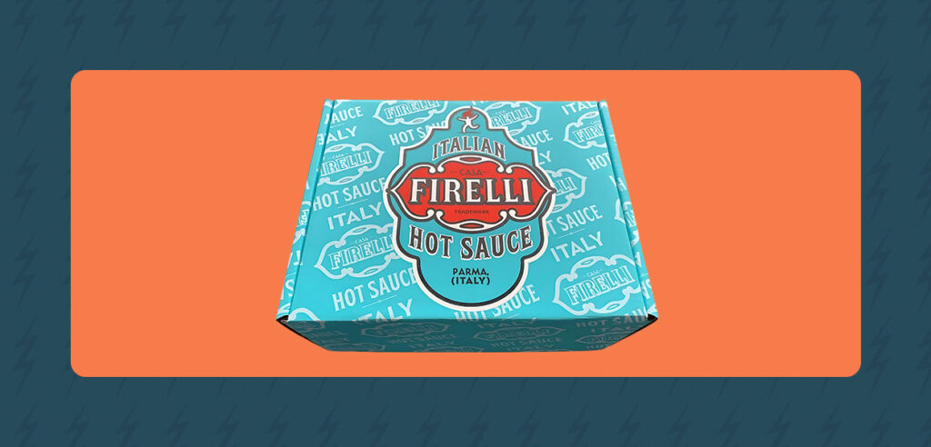
High-end packaging is achievable on a practical budget, yet many buyers believe polished, on-brand boxes mean choosing between quality and cost.
The reality is more encouraging. You can narrow the gap between plain corrugated shipping boxes and packaging that makes a dynamic first impression by making strategic decisions that build on each other, elevating your brand without inflating your budget.
Material is the foundation for every other decision you make. Before you design artwork or choose a print method, the substrate determines what’s visually and structurally possible. Your material choice influences how faithfully your design reproduces and how much flexibility you have in selecting print methods and the final cost structure.
Choosing between kraft and white corrugated boxes shapes customers’ opinions of your brand. Kraft creates an earthy, utilitarian aesthetic that communicates sustainability and positions you as environmentally conscious. White projects polish and presents a more refined image. Businesses with a standard, consistent color palette typically need white liner to reproduce vibrant, full-color fidelity. Bright colors printed on kraft may appear muted or distorted because the brown base absorbs and shifts the ink, though black prints reliably.
Flute profile also affects surface quality and print sharpness. Finer flutes create a smoother surface that captures additional detail and produces a more premium appearance, while coarser flutes provide more structural strength but can blur fine design elements. B-flute offers a good balance of strength and print quality for most applications. E-flute provides an excellent printing surface for high-detail artwork, though it typically isn’t ideal for heavy products.
Designs with fine typography, intricate graphics or sharp brand elements tend to deliver better results with a finer flute. Ask your supplier which corrugated flute types pair best with your chosen print method and design complexity.
Selecting a print method is one of the highest-leverage decisions a B2B buyer makes. A print method that does not fit your volume can increase costs or limit quality. Each method performs best at specific volumes, and matching your production to the correct option maximizes value.
If you’re launching a product, testing a new design before committing to scale or running a limited-edition item, digital printing gives you flexibility without a hefty price tag. As an affordable choice for lower-volume and short-run orders, digital eliminates plate setup costs, making smaller runs economically viable where traditional techniques would require a prohibitive up-front investment. This method also delivers excellent fidelity for complex, multicolored or gradient artwork, including photographic imagery.
Explore our full-color digital printing capabilities and review the different types of printing on corrugated boxes to understand the advantages of this option.
Flexographic printing balances quality with cost efficiency across regular production schedules for brands with consistent packaging needs that want reliable reproduction without stepping up to litho. It’s a mid- to high-volume workhorse, delivering consistent, repeatable results for solid colors and logos across production runs.
When quality and brand fidelity are nonnegotiable, lithographic printing provides the color accuracy and visual polish that premium brands require. It delivers magazine-quality, impression-free print with exceptional color clarity and vibrancy, producing output without indented text or lines that can distract from the design. Litho is excellent for brands whose high-volume packaging needs to look as sophisticated as the product inside.
How you create and prepare your artwork can have as much impact on perceived quality as your chosen print method. Knowing how to improve packaging design starts with absorbing these packaging design tips that cost nothing to implement but measurably affect customer opinions.
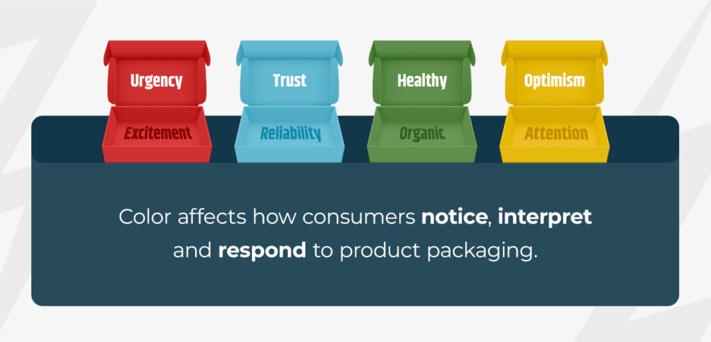
Color affects how consumers notice, interpret and respond to product packaging. Since cluttered, multicolored designs often signal budget brands trying too hard, the secret to making packaging look expensive without adding cost is to choose fewer hues, apply them consistently and let restraint speak for itself.
Present your designer with a defined palette and resist the urge to add more. Black, white, deep navy and muted earth tones consistently suggest premium perception across categories, while overly warm or loud combinations can reduce perceived quality.
When your packaging colors match your website, marketing materials and other brand assets, you create visual consistency that builds recognition and reinforces brand memory at every interaction. Once you select your palette, apply it confidently and systematically across all customer touchpoints to make your identity easier to recognize and position your product as thoughtfully designed.
Readable typography combined with intentional white space signals excellence more effectively than hectic, crowded layouts. Remember, negative space is not wasted space. It emphasizes your brand elements, bringing them to the forefront. That’s why many of the world’s most recognizable brands, including Nike and Apple, have embraced a minimalist aesthetic, with clean logos surrounded by generous breathing room.
Polished execution on the top face shouldn’t give way to neglected sides. Consistency across all panels of the container matters. Brief your designer on what to include, such as clear hierarchy, readable type sizes and consistent brand elements across all surfaces.
First impressions are more impactful than you may realize. Since customers often form lasting perceptions when unboxing their purchases, made-to-spec sizing is a strategic decision that improves your bottom line.
When a customer opens a perfectly sized container and sees a product fitting snugly with minimal packing material, it conveys premium attention to detail. In contrast, a box that’s noticeably oversized compared to its contents immediately undermines people’s perception. Excessive void fill, product shifting in transit and a sparse interior can make packaging feel cheaper and less intentional.
Right-sizing wins in two categories — aesthetics and cost. Using less material can reduce dimensional weight, which may lower your freight costs depending on carrier pricing and shipment details. If your e-commerce brand ships hundreds or thousands of units each month, these savings can add up quickly and improve your margins on every order.
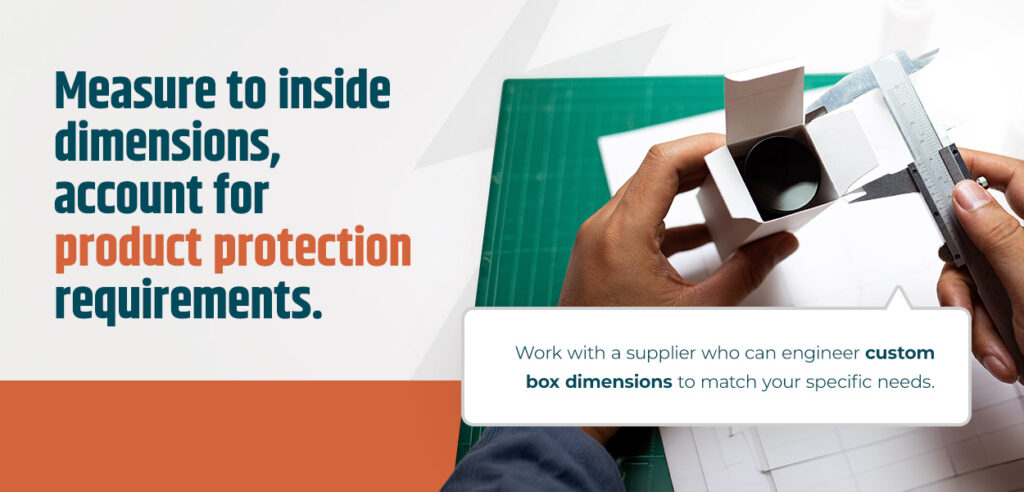
Measure to inside dimensions, account for product protection requirements and work with a supplier who can engineer custom box dimensions to match your specific needs.
Your order quantity also affects which print method delivers the best value. Understanding the volume range for each option helps you batch orders strategically, avoid unnecessary setup costs and get the quality level your packaging needs.
Print method selection affects your total cost and lets you make more informed volume decisions throughout the year.
Since the cost of reprinting 10,000 boxes far outweighs the cost of a proof, it’s wise to sample before a full run to catch errors early. Batching seasonal packaging updates into a single larger order can also reduce per-unit cost compared to multiple smaller runs throughout the year. For example, if you know you’ll need 1,000 boxes over the next six months, ordering them all at once instead of placing four separate 250-item orders will unlock better pricing.
Here are answers to questions buyers typically ask when evaluating custom packaging options.
Start by choosing your material. Then, select the print method that matches your volume and keep your design simple, with a limited color palette, clean typography and generous white space. Remember, premium perception comes from intentional decisions, not expensive add-ons.
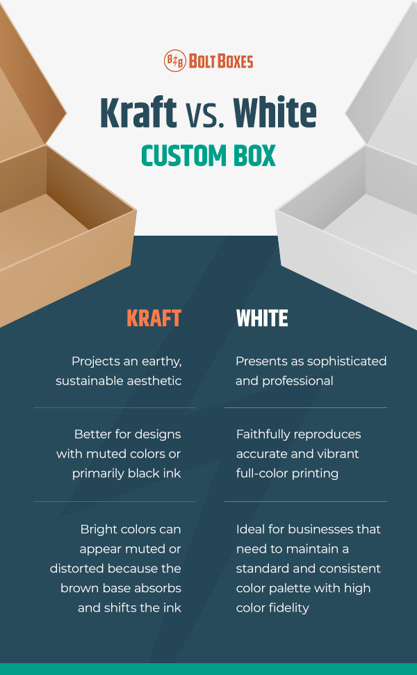
Yes. White liner faithfully reproduces accurate, vibrant full-color printing. Kraft is better for designs with muted colors or primarily black ink, but it projects an earthy, sustainable aesthetic that some companies intentionally choose. The decision should align with your brand positioning and design needs.
Digital printing is typically the best choice for smaller runs. It eliminates plate setup costs and delivers high color fidelity, making it economical and flexible for low-volume orders, product launches or design testing.
Your order quantity determines which print method you choose. Digital is usually practical for smaller or test orders, flexo works well for repeat packaging needs and litho is optimal for larger runs that require premium print quality. If your team takes a proactive approach, grouping orders lets you use your budget more efficiently.
You will need to send print-ready artwork if your custom box supplier doesn’t provide graphic design services. The supplier’s prepress team typically handles file preparation, color matching and plate creation to accurately reproduce your design, but the initial work is your responsibility.
Bolt Boxes gives you options, with digital, flexographic and lithographic printing under one roof. Choose your method based on your project needs. Our in-house prepress team and G7 Master Certification ensure your brand colors print accurately every time, while all-Minneapolis manufacturing delivers fast lead times and quality control at every stage.
These decisions make your packaging easier to scale, maintaining consistency as product lines grow and seasonal campaigns change. When you’re ready to move forward, use our online configurator to design your custom box and see pricing in real time or reach out to discuss structural prototypes and printed samples before committing to your full run. Let’s build packaging that works as hard as your product.


