Packaging is pivotal in establishing brand identity and influencing customer purchasing decisions. Among the various design elements that make up effective packaging, typography often gets overlooked or put off as a last-minute decision. However, typography and branding go hand in hand. The fonts and lettering used on product packaging are more than aesthetic choices — they are functional tools for communication, brand identity and connecting with target audiences.
In this article, we’ll explore the importance of typography in packaging design and how your business can harness the power of fonts to influence consumer behavior and product perception.
Typography is a component of graphic design that focuses on the style, arrangement and appearance of letters and text. It’s the art of arranging type to make written language readable, appealing and impactful. Typography encompasses several basic elements:
While font and typeface are usually used interchangeably, the typeface is the broad family. Font technically refers to the specific size, weight and style within a typeface family.
Typography plays a significant role in various aspects of packaging design, including:
Typography and branding interrelate. A brand’s typography choices help craft a distinctive brand identity. By consistently using the same fonts across packaging and all brand materials, companies create a cohesive visual language that consumers instantly recognize. Much like a logo, a brand’s signature typography style becomes integral to its identity, reinforcing brand recognition and recall.
In a crowded retail environment, innovative typography can stop consumers in their tracks. Bold, unique lettering can attract the eye and entice shoppers to take a closer look. Moreover, font choices influence how consumers perceive a product. Elegant scripts may convey luxury, while clean, minimal sans-serifs feel modern and approachable. Typography sets the tone before the consumer even reads the words, shaping their initial impressions of the product and brand.
Fonts have the power to evoke emotional responses and forge connections with consumers. Playful, handwritten typography might elicit feelings of warmth and authenticity, while sharp, angular fonts could communicate strength and efficiency. Companies can tap into their target audiences’ emotions and cultivate brand loyalty by aligning typography with their values and personality. The right typography can make your brand feel more relatable, trustworthy or aspirational, depending on the desired emotional connection.
Thoughtful typography supports a brand’s marketing efforts. It ensures packaging remains impactful and on-brand when featured in advertisements, social media or point-of-sale displays. For global brands, typography aids adaptability, as fonts can be customized for different languages and cultural contexts while maintaining brand consistency. Well-designed typography can transcend language barriers and help brands connect with diverse audiences worldwide.
In competitive markets, distinctive typography can set a product apart from the rest. Unique fonts highlighting product attributes or benefits can catch consumers’ attention and communicate value at a glance. Departing from generic typography and using script and logotype in branding allows businesses to give their products a memorable edge. Differentiated typography helps products stand out on crowded shelves.
When designing packaging typography, several factors help ensure optimal impact, visual appeal and brand alignment:
Here’s how to implement the above factors to maximize typography for better product packaging:
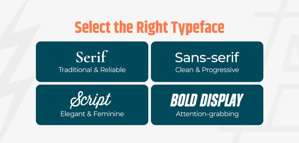
Approach typeface selection strategically, considering your brand personality, target audience and packaging design. Classic serif fonts convey tradition and reliability, while modern sans-serifs feel clean and progressive.
Script fonts add elegance and femininity, and bold display fonts command attention. For example, a children’s toy brand may opt for a playful, rounded font, and a luxury skin care line may favor a sophisticated serif.
Above all, packaging typography must be legible. Select fonts that remain crisp and clear at various sizes and distances. A/B test different typography options to determine which resonates best with consumers.
Effective packaging typography establishes a clear information hierarchy, guiding the consumer’s eye through the packaging information. It helps prioritize content and creates a logical flow that enhances the user experience.
Use larger, bolder fonts for the product name and unique selling points, making them scannable. Supporting details can be in smaller sizes while maintaining legibility. Letter spacing and line height contribute to visual hierarchy, drawing the eye to the most important information first. Additionally, contrasting colors and weights help differentiate different levels of information.
Typographic color choices should complement the overall packaging palette. High-contrast color combinations, such as the classic black text on a white background, offer the best readability. If you opt for colored typography, ensure sufficient contrast to avoid clashing colors that strain the eyes.
Experiment with finishes and textures to enhance the tactile experience. Raised or embossed lettering adds dimension, while metallic inks convey luxury. Additionally, consider how typography interacts with the packaging’s attributes to create a multisensory impact.
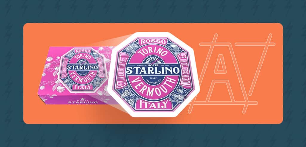
Typography in packaging helps tell your brand story. For a distinctive look, you can invest in customized typography. Bespoke typefaces tailored to the brand’s unique style help products stand out on the shelf. While custom fonts require more resources, they are valuable brand assets, reinforcing recognition and loyalty.
Use unique lettering treatments or illustrative fonts to reflect your origin’s values or personality. You could also include typographic elements like QR codes linking to brand videos, which can engage consumers by weaving a memorable narrative.
To ensure consistent typography usage across all brand materials, develop comprehensive font brand guidelines. These guidelines specify approved typefaces, sizes, alignment, colors and usage rules for various applications.
Font brand guidelines help maintain typographic integrity and reinforce brand recognition. They also streamline the design process and make it easier for multiple teams to work with your brand typography.
Functional typography, like directions or ingredient lists, should be clear and easy to read. Use clean, simple fonts and ample spacing to improve readability. Design flexible typography that maintains legibility in various packaging shapes and sizes. Investing in scalable vector-based typography ensures consistency from small product package labels to large shipping boxes.
If you serve multilingual markets, your typography should adapt seamlessly to different text lengths and characters while upholding brand style. Enhancing functionality through typography improves the user experience and demonstrates a commitment to consumer needs.
Typography is a potent tool for amplifying brand identity, engaging consumers and driving product sales. By implementing strategic typographic practices, you can elevate your brand’s visual impact and forge meaningful connections with your target audience.
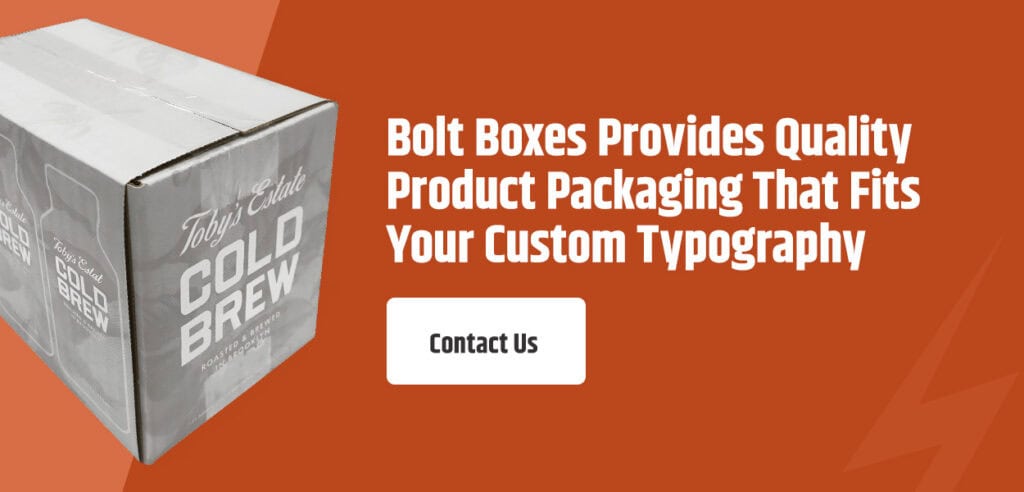
As an industry leader in custom packaging solutions, Bolt Boxes is equipped to help you harness the power of typeface branding. With over 60 years of experience, cutting-edge printing capabilities and a team of structural design experts, we can bring your typographic vision to life on premium corrugated cardboard boxes. From selecting the perfect fonts to ensuring crisp, vibrant printing, Bolt Boxes offers an unparalleled packaging experience that showcases your brand’s typography and voice.
Contact us today to experience custom packaging that captivates consumers and drives results.